10 Tips to increase the $ of your forms
178 percent increased Mobile Conversion
Translated form my dutch blog published in Marketingfacts
Michiel Jansen, Blue Breeze Digital@michielleendert 21 januari 2016
By the way: Why translate and re-publish a article from 2016? Because a lot of websites still make the mistakes that the tips in this article help avoid! This project was realized while working with Online Dialogue and in close collaboration with client ICS, Amsterdam design agency UncInc & Anouk van Lieshout.
10 Tips to increase the $ of your forms
Convert! A visitor to your form is only one step away from what you want them to do. All your marketing, advertising and search engine optimization activities work towards this. If someone drops out in that form, you often lose the entire investment.
In this article you will get tips on how you can achieve much more with a few simple adjustments to your forms. Tips
- That you can quickly apply and …. also
- Some tips for which you may have to adjust something in the backend.
The conversion improvement of this case indicates that these tips are worthwhile: since the redesign, the conversion of Visa Worldcard (ICS) has risen as much as 178 percent on mobile devices! First I will start with the tips. Then if you are still with me instead of starting to improve your forms directly 😉 I have given some background on the case so you can see for yourself what the project was all about and how we worked with 3 freelancers, 2 agency’s and the client.
10 Tips to increase the $ of your forms
Below you can see what has been improved in the redesign to make this form as small a ‘barrier’ as possible. To reduce friction, increase persuasion and keep the visitor in their flow: See Why Reducing Friction and Increasing Motivation are the Holy Grail ConversionSweetspot-Series.
Most design and persuasion adjustments that we have applied have their origin in psychology. The inspiration for this can be found in the ‘Wheel of Persuasion’ of my friend & then colleague Bart Schutz; per change we name, where possible, the ‘persuasion technique’.
- Arrows to help determine the viewing direction: aka, the downward visual cue.

2. Clarity about the type and number of steps (self efficacy): Divide into three (for a credit card application) small steps (foot in the door). If you need more: don’t count the confirmation page as a step: if people see: step 1 of 10 they will be out of this form in no time unless you are selling the last ticket to a very very popular concert or something else with a high urgency factor.

3. Confirmation that the user is ‘doing well’ by using green arrows and green lines around the form fields(self efficacy).
4. Incorporation of space: rather a longer form with space than short and full form (rest + focus = conversion). (Empty space + logic = flow = conversion). As there is more and more mobile visitors on websites, you should give special attention to this.

5. Consistency in alignment: all fields in one direction of view (consistency).
6. Easy questions first: do not start with questions or data that people have to look up. Start with things they know by heart; for exmaple their name, birthday, address (self efficacy).

7. Offering an alternative route on mobile: by reporting the option to call more prominently (this led to 25 percent more requests).\
8. Bundle the related questions (consistency): Name, address, family, financials etc.
9. Mention the ‘regret’ option: Cancelation, Return policy, cooldown period etc. A lot of marketeers hide this but showing this clearly makes a decision less stressful and therefor easier to make!9.
10. Mobile FIRST, Saving the best for last 😉 Still you see a lot of design processes starting out using a 22 inch Macbook screen, or bigger. Stop doing that! People DO start and finish tasks on Mobile, on the road, on the coach, waiting for the plane. Say this sentence out loud & visualize it! So you never forget 😉 “When people have time…… they are on Mobile a lot of the time.”
Some ultimate Pro-tips:
- Consult with the product manager or all information requested in the form is really needed. Each field is an extra barrier with which you create dropout. Or goal is to sell NOW. Our goal is NOT to fill the database so we can spam visitors and maye sell in the far future!
- Often a critical consideration from the ease of use teaches you that you can ask a lot of data and specific settings of the product after the conversion. The dream process conversion consultant looks like this: quickly become a customer, send confirmation and only then collect additional functionality and necessary information. Plus Cross and Upsell: Always Be Selling!
- Actually: the performance of the form is NOT fully determined by the form. Sounds counter-intuitive and a bit out of place for this article right? But think about this: The confidence in the product, website and USP’s installed in the user BEFORE they enter the form……. has a huge impact on the performance of the form. That is why sometimes when you optimize a form, you need to look at the product & conditions, reviews, USP’s etc first. Getting this is why algorithms will never beat humans as optimizers in my (unproofed opinion).
Let the Customer Chose the channel: finish later, chat, social…
We were not sure whether visitors would finish the application on mobile. For that reason – and because the customer is king, of course – the mobile homepage also offers a ‘Call me now ‘ button. On top of the increase in mobile applications of 179 percent, it has also led to many very successful applications in the call center. And then the user can also chat live with the service center at any time. All in all, this example proves that you can score an impressive improvement with a form of more than 30 fields. Also a way you can of course lead mobile visitors to a call center to complete a conversion. Another way is to email a hyperlink after completing the name and email address to finish on desktop; see the ‘save for later’ example.
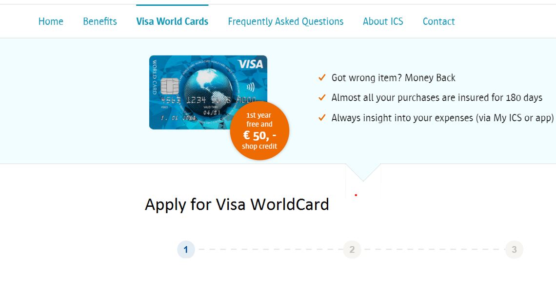
About the ICS Case: Visa World Card
Optimizing in small increments, small steps & changes works if you site or form is already an 8. If it is below that level: you have to ‘jump into the deep’ and create something new from scratch. The latter is what ICS asked us to do. At that time that I worked at Boutique Conversion Agency Online Dialogue (2012-2015). ICS approached us to redesign the application form for their own product ‘Visa World Card‘ and for their white label credit cards like ‘ANWB‘ and ‘Bijenkorf’.
Starting point
The ‘old’ Visa Worldcard form did lead to Mobile Conversions though it was depressingly low. The conversion on desktop was 270 (!!!) percent higher! As optimizers say: Enough room for improvement ;-). We noticed a number of things about the old form;
- Must: with each field there were ‘mandatory stars’ (*).
- Reading direction: the reading direction went two ways, from left to right (eg initials and insert) and then again from top to bottom.
- No positive feedback if a field was filled in correctly. Heavy red error codes if a field was not complete.
- Many pulldowns that work badly on many phones.
Led to complete Redesign of all ICS platforms
The end results of this redesign was so spectacular that the form is being used in the German market and…. That we were also asked to do the Visa Businesscard, Mastercard , Mastercard Business websites and a new Loan Platform. Despite the fact that ICS had been a customer for years, we found the assignment exciting. Why? Approximately 60 percent of the Dutch have a credit card and most of them are applied for and provided through ICS. So it had to be really good! Usually, an extensive analysis precedes such a redesign, but there was no time for that. Fortunately, thanks to the long relationship, there was already a lot of knowledge about ICS at home.